This is a school project. Its purpose is to find potential client in Ottawa and get the customer’s authorization to provide free or paid rebranding. The progress of the work will be reported to the customer regularly and the project will be completed at the end of the semester.
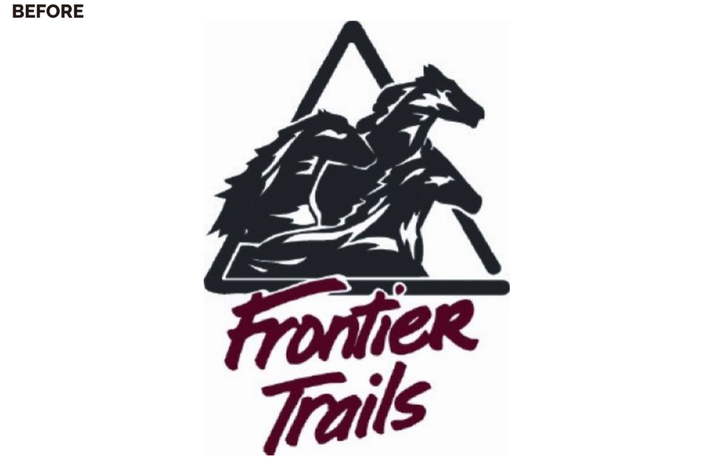
The client of this project is Frontier Trails. Frontier Trails was founded in 1976 by Dave & Marie Tubby. Frontier Trails was originally located in Fernleigh until 1986, and then moved to the present location in Eganville with 100 acres of property on the beautiful Bonnechere River. In 1996 Frontier Trails was registered as a non-profit camp.
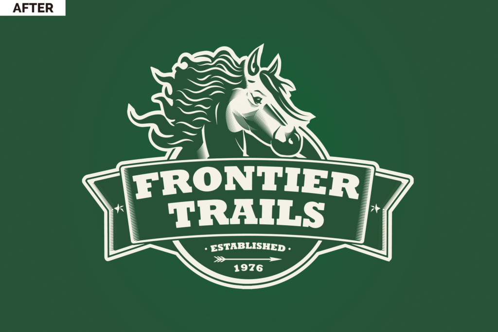
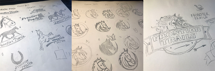
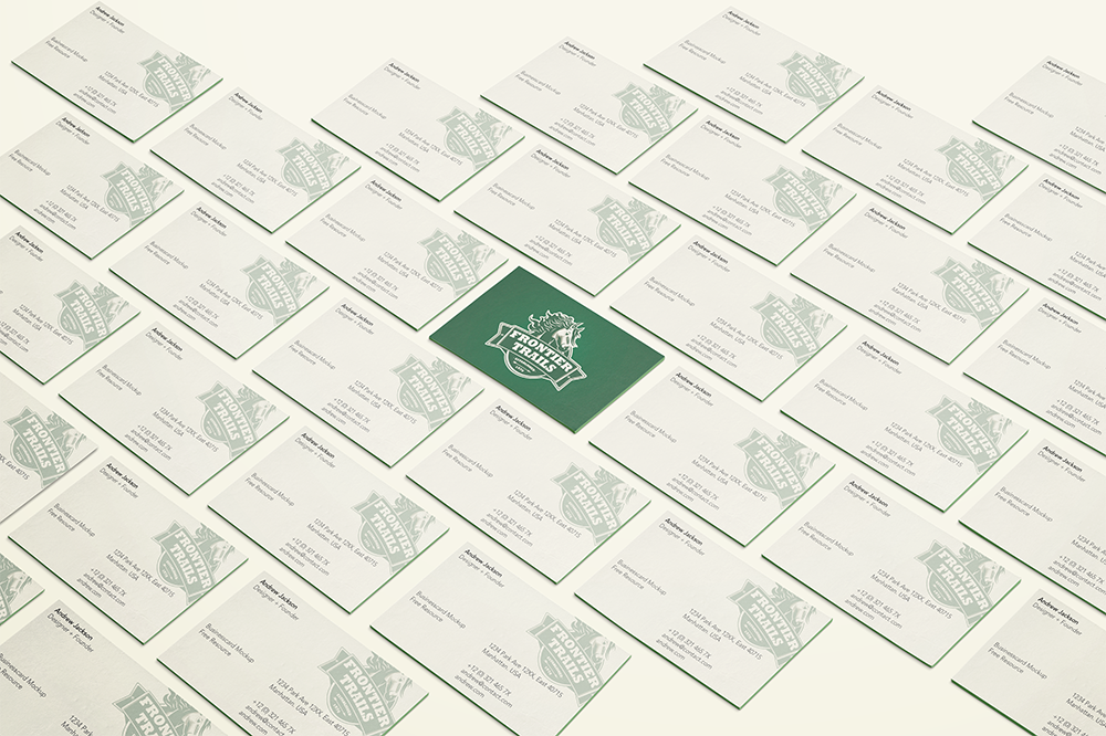
About New Logo
A new logo created with the horse’s illustration, the logo uses a woodcut effect to form a unified style with the old logo. The horse-based logo element can help companies highlight the uniqueness of their business and quickly screen out the main audience. On the customer side, the logo helps client quickly understand the culture of the company and the main business. The logo colors are mainly green and light yellow, helping the company to create a lively and vibrant business image.
About The Font
Rockwell was chosen as the font face for frontier trails’ logo because of the Western retro style.
Closing Thoughts
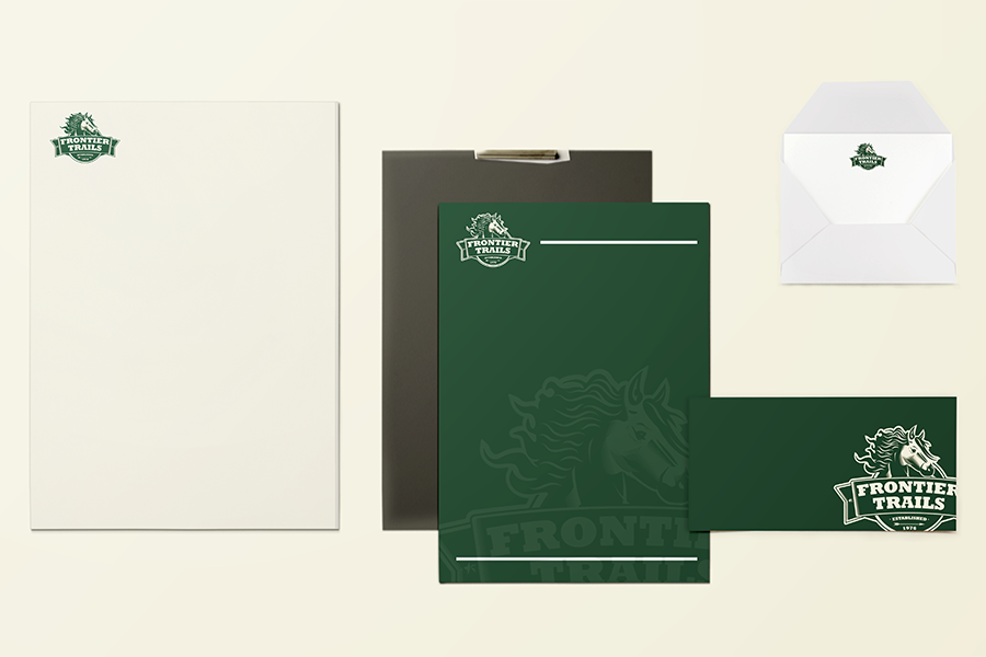
The biggest challenge I face with this brand is the scalability of the logo on different occasions. Although the badge design is difficult to take advantage of in a small space and it will be difficult to see the brand name, but it is still suitable for most occasions.